
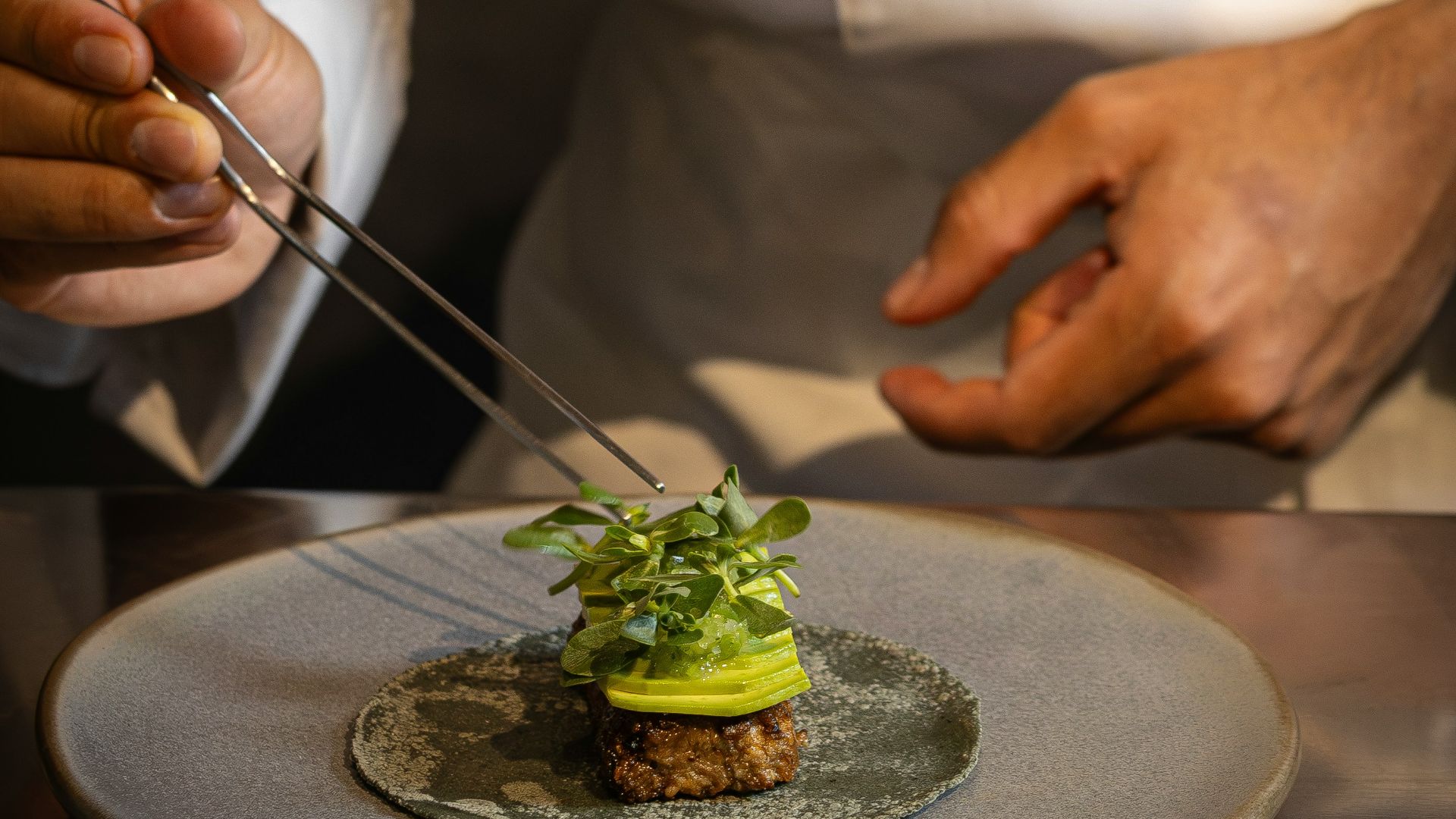
 Alfonso Betancourt on Unsplash
A good plate of food starts doing its job before the first bite. Color, shape, texture, and placement all give your brain clues about freshness, care, and flavor. That doesn’t mean your dinner needs to look like a tiny tasting-menu sculpture with tweezed herbs and one dot of sauce. Most of the time, it just means giving the food a little order and letting the best parts stand out.
Plating also fits neatly into a food, health, and wellness conversation, as long as we don’t turn it into something bigger than it is. A thoughtful plate can help you notice variety, portion placement, and how different foods work together. In restaurants, presentation should be practical, functional, appealing to the senses, and still centered on flavor and texture. At home, that’s a pretty useful goal: food that feels cared for, without making dinner feel like a project.
Start With The Plate, Not The Garnish
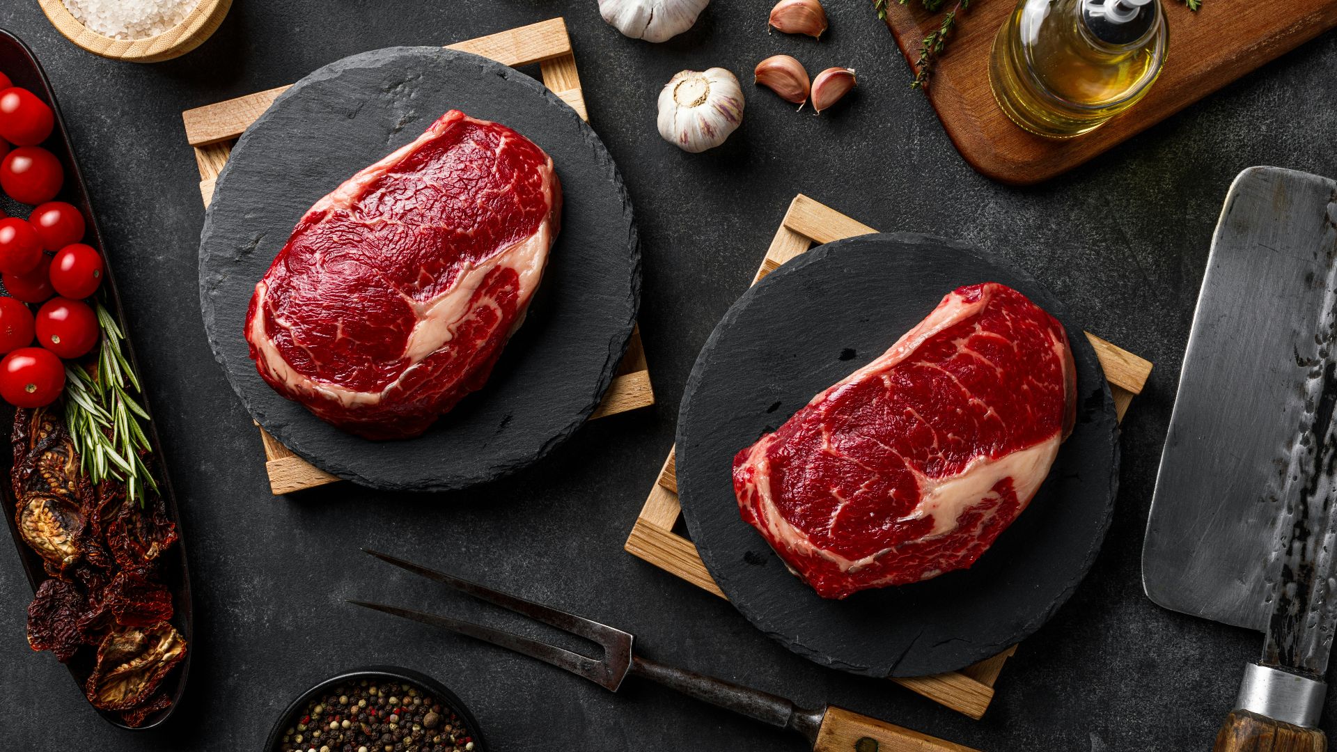
The plate you choose isn’t just background noise. It shapes how the whole meal feels before anyone picks up a fork. Rouxbe Online Culinary School includes plate color, texture, shape, and size among the basic parts of plate design, and it notes that white, round plates are commonly used in plating.
Still, you don’t need every meal on a plain white plate. A shallow bowl can make grains, roasted vegetables, or saucy beans feel generous and cozy, while a darker dish can make pale soups or creamy sauces look a little more striking. The point is to choose something that helps the food, not something that competes with it. A busy plate pattern can make even a gorgeous salad look chaotic.
Size matters, too, and this is where a lot of home plates go sideways. A plate that’s too small makes a balanced meal look crowded, while a plate that’s too large can make a totally normal portion look lonely. Johnson & Wales University points to negative space, meaning the empty area around the food, as part of creating balance on the plate. You’re not aiming for tiny portions here, just a little breathing room.
Building Around Contrast
A professional-looking plate usually gives your eye somewhere obvious to land. The Culinary Institute of America describes the focal point as a way to make a dish feel logical and sensible to the guest. At home, that focal point might be salmon, roasted chicken, risotto, or a colorful vegetable centerpiece. Once you know what the main feature is, the rest of the plate gets much easier.
Place that main element first, then let the other parts support it. Grains, vegetables, sauce, and garnish should feel like they belong around the focal point instead of fighting for attention. The Culinary Institute of America notes that off-center placement can look more natural, while centered arrangements tend to feel more formal.
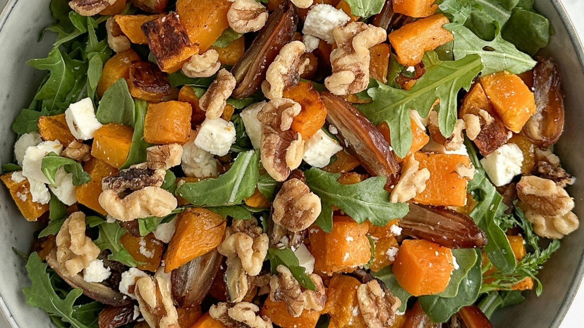
Color does a lot of work here. Johnson & Wales University describes vibrant and contrasting colors as naturally attractive, especially compared with a flatter, beige plate. This doesn’t mean you need edible flowers, rainbow sauces, or any of those fancy restaurant flourishes. Parsley on potatoes, pickled onions on tacos, roasted carrots beside chicken, or chili oil over hummus usually does the job just fine.
Texture matters just as much. The Culinary Institute of America notes that texture affects how food looks and how it feels in the mouth, and that too much of the same texture becomes monotonous. That’s why creamy soup tastes better with toasted seeds, herbs, croutons, or a little swirl of oil. It’s also why soft pasta can benefit from crisp breadcrumbs, fresh basil, or grated cheese.
Don’t Clutter
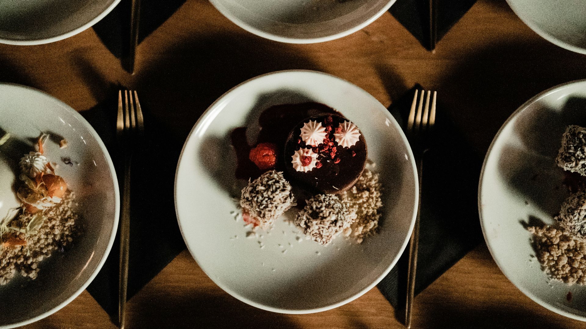
Sauce can make a plate look polished, but it can also make your meal feel messy if it’s added without much thought. A small pool under a protein, a spooned line beside vegetables, or a few dots of thicker purée can guide the eye and support the bite. The sauce still has to make sense with the food, though. A random drizzle just for looks doesn’t help anything.
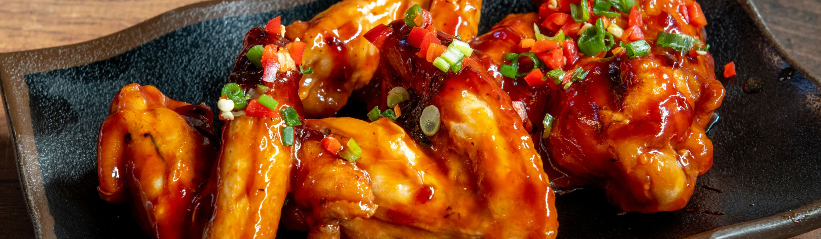
Garnish should follow the same rule. Rouxbe explains that garnish is a finishing step added for color, texture, and visual appeal, and that all garnish should be edible and something you’d normally eat. Fresh dill on salmon, basil on tomato pasta, toasted nuts on squash, and lemon zest on seafood all make sense because they belong with the dish. A stiff herb sprig that everyone pushes aside doesn’t really help anyone.
Height can also make a plate feel more professional, as long as it stays practical. The Culinary Institute of America notes that cooks can add dimension by rolling, folding, piling, or arranging foods in shapes and clean lines. You can twist pasta into a loose nest, lean asparagus against fish, or place sliced steak partly over mashed potatoes.
The final move is simple, and honestly, it’s the one that makes a plate feel most restaurant-ready. Wipe the rim, remove stray crumbs, and serve the food at the right temperature. The Culinary Institute of America emphasizes that no matter how artful the display is, taste remains the most important element, along with serving food flavorful and at the right temperature. A beautiful plate should make the meal more inviting and desirable enough to cut into.