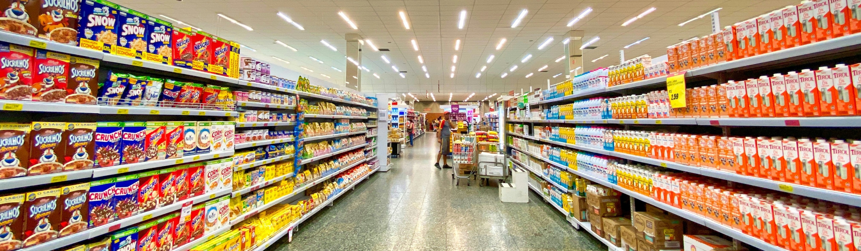
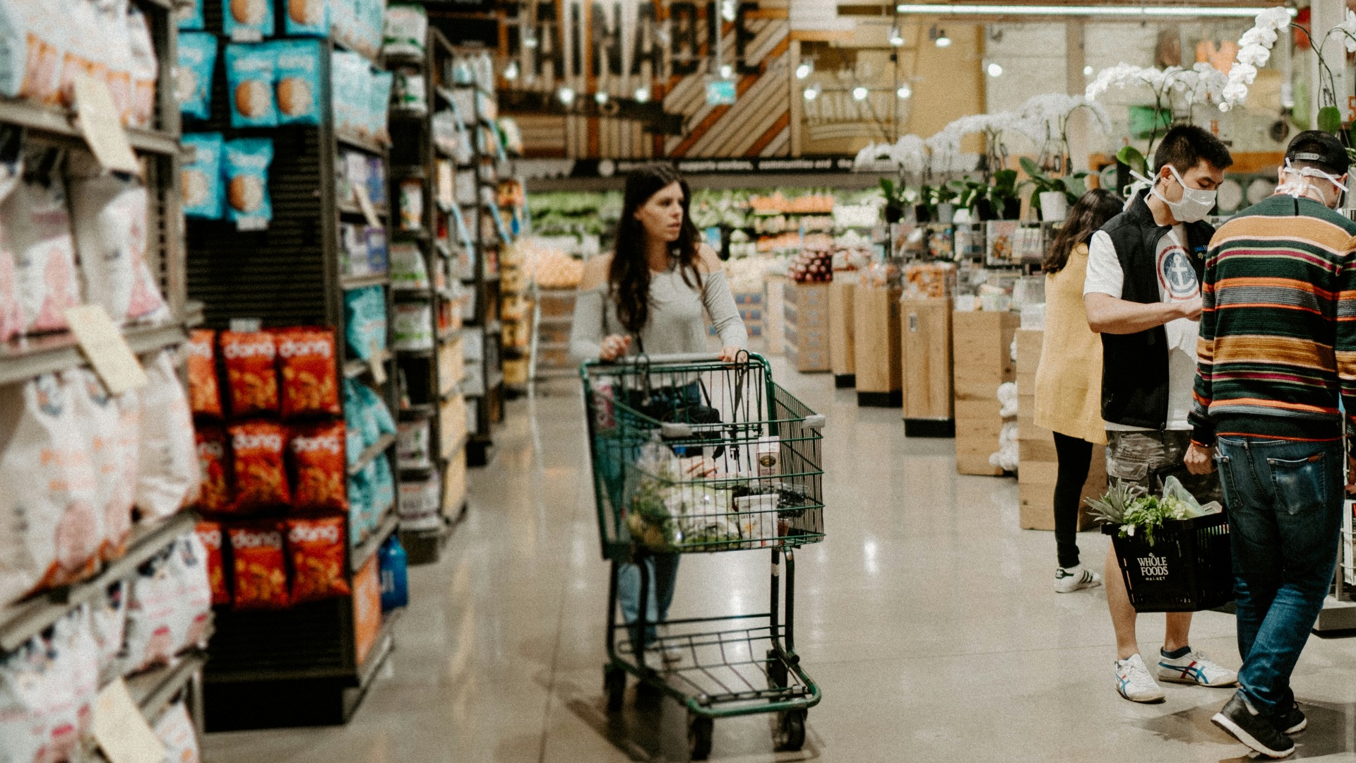
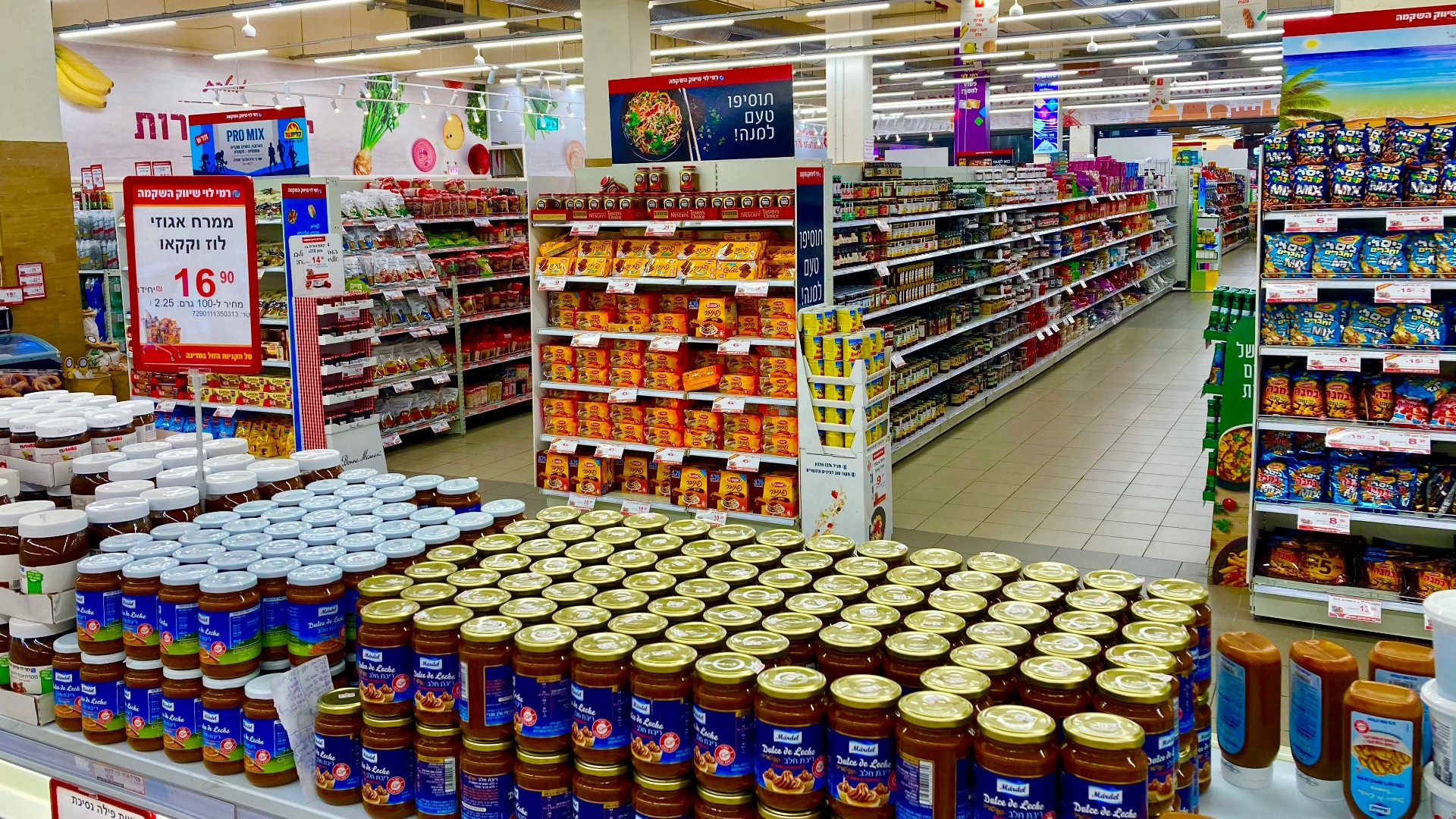
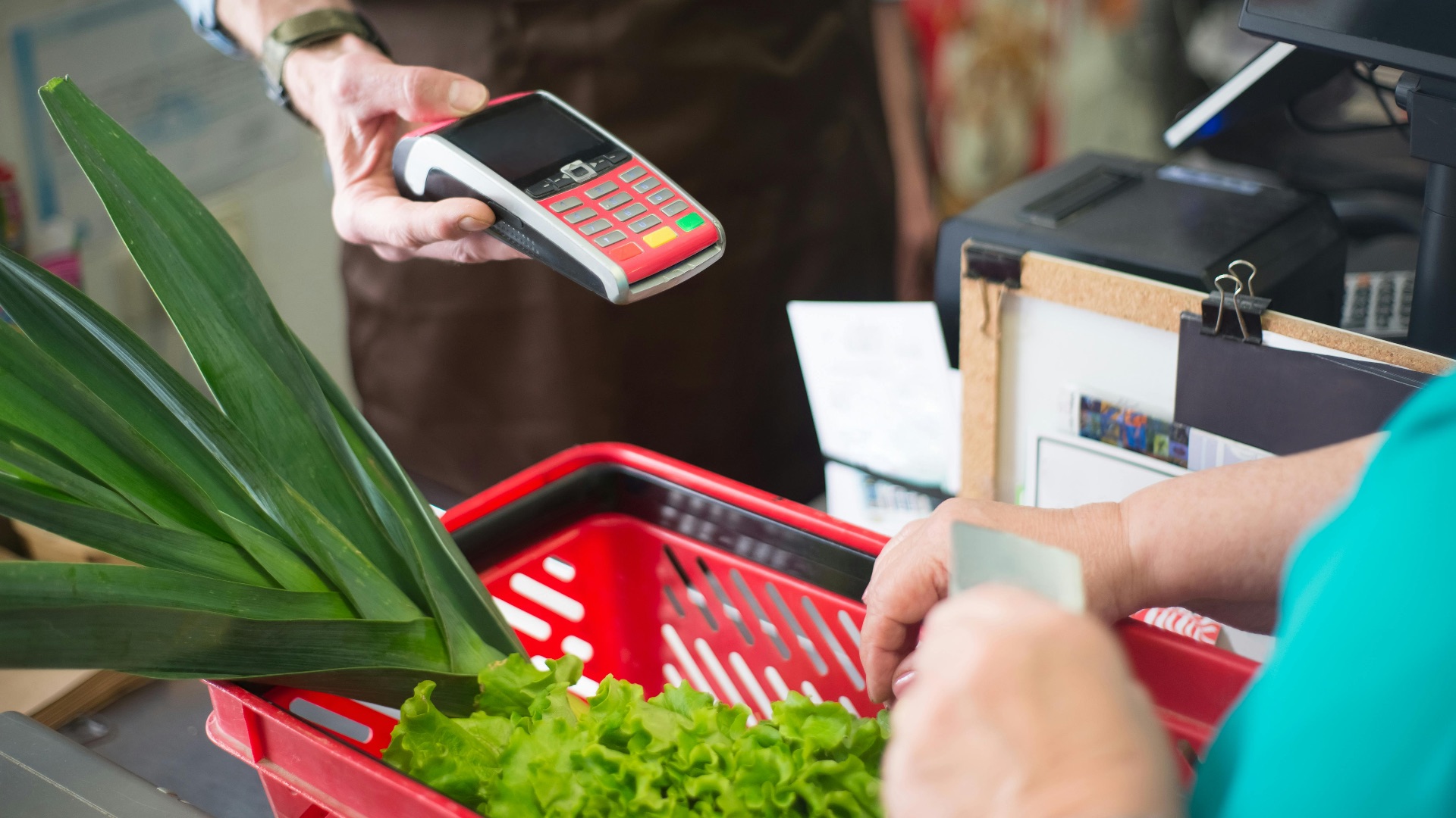
The Store Isn’t Random, It’s Choreographed
A supermarket can feel like a simple place to grab dinner ingredients, but believe it or not, a lot of what you see (and smell) is meticulously planned to nudge your choices. Layout, atmosphere, and pricing cues are designed to keep you shopping longer, steer your eyes to higher-profit items, and make impulse purchases feel totally reasonable. Once you spot the patterns, you’ll realize your cart didn’t “accidentally” fill itself, but that you've fallen prey to the marketing system. Here are 20 psychological tricks grocery stores use to make you spend more money.
 Joshua Rawson-Harris on Unsplash
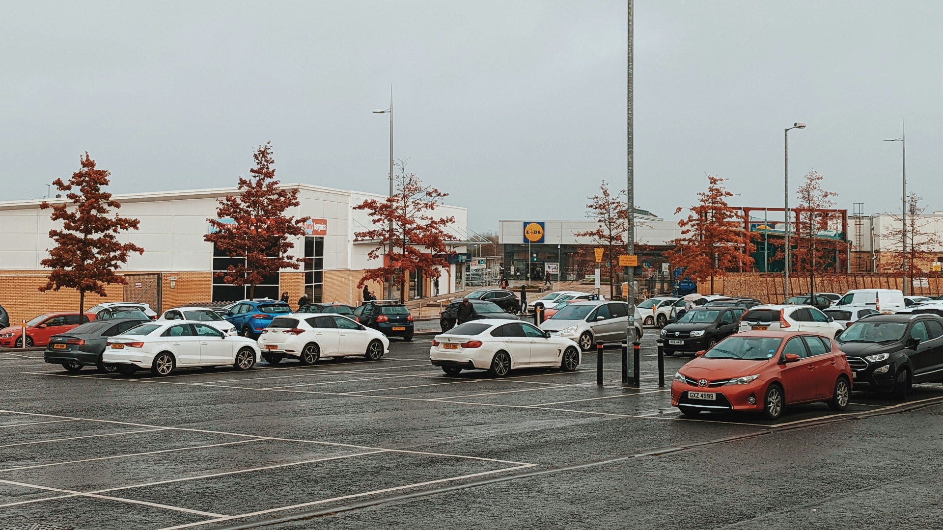
1. Free Parking
Think about it: if you had to pay to shop, you probably wouldn't go. Free, easy parking lowers your stress before you even hit the automatic doors. When you’re more relaxed, you tend to browse and linger instead of speed-running through the aisles to make sure your car won't be ticketed, and that can translate into a bigger bill at checkout.
2. The “Hotel California” Exit Strategy
Some stores are built to be easy to enter but annoying to leave without passing through the registers. When turning back toward the exit feels awkward, buying something can seem like the path of least resistance, meaning you end up coming out with something even if you didn't want it.
3. The Produce & Flowers Mood Booster
Believe it or not, bright produce and fresh flowers near the entrance are strategically placed there to lift your mood; after all, feeling a little happier makes splurging feel a little more justified. It also kicks off the trip with a “healthy” impression (which usually loosens once you browse longer).

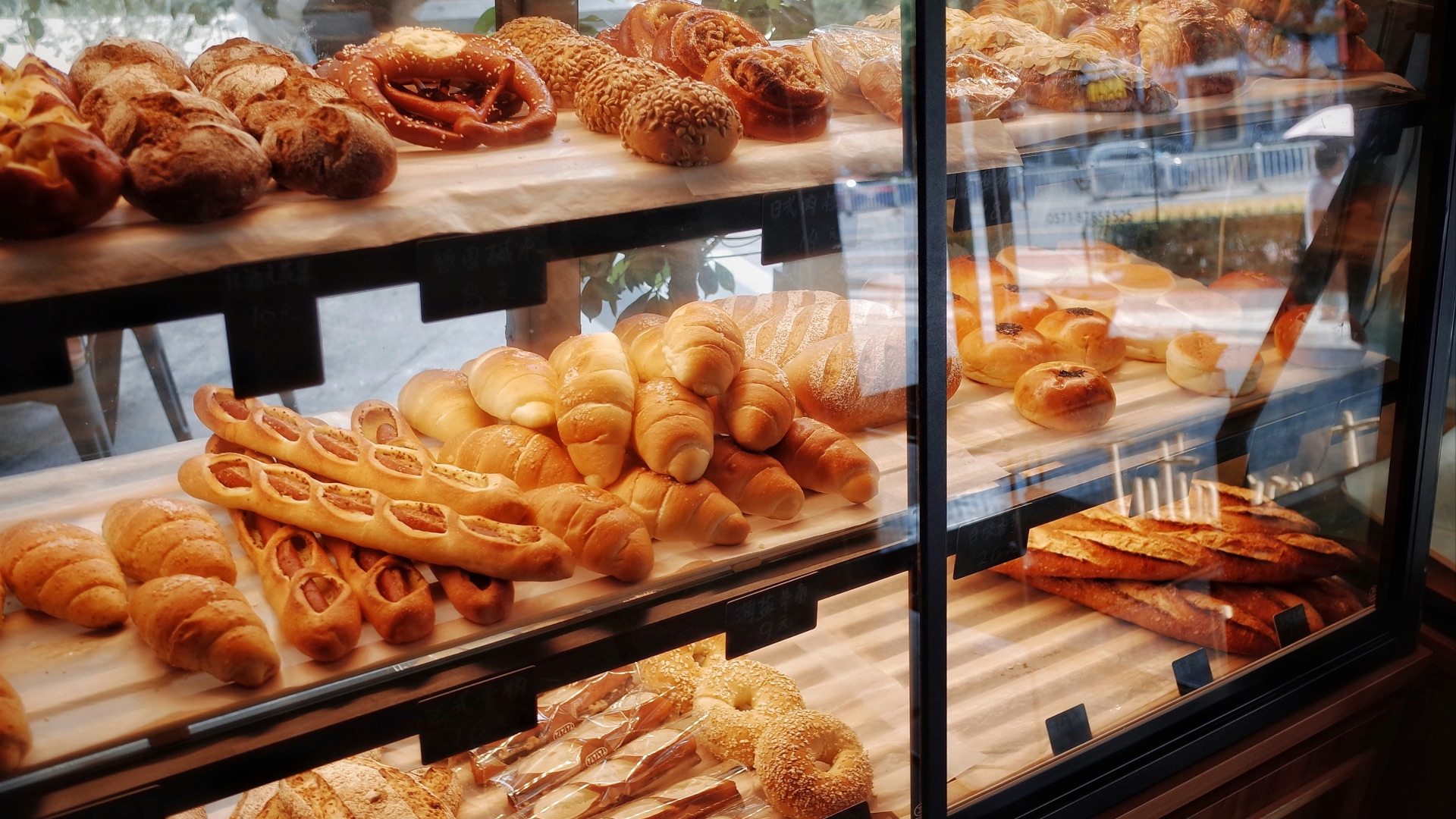
4. Bakery Aromas That Make You Hungry
Fresh-baked smells can make your brain decide it’s snack time, even if you strategically ate 20 minutes ago so you wouldn't be hungry at the grocery store. And hunger doesn’t just change what you buy; it usually increases how much you buy. Some stores even use an artificial bakery scent to get that effect.
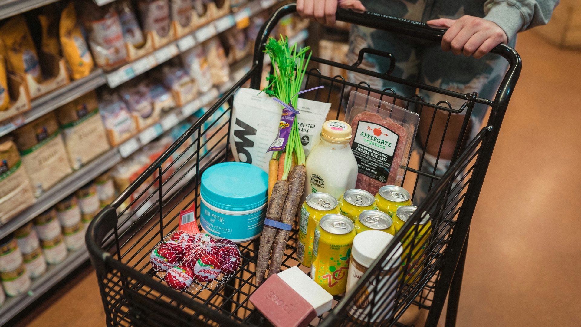
5. Bigger Shopping Carts
A huge cart makes a few items look like barely anything. That empty space can push you to keep adding things until the amount in your cart feels “right.” Stores know that cart size can greatly influence how much people buy, so if you've been wondering if the carts are getting bigger, it's not just your imagination.
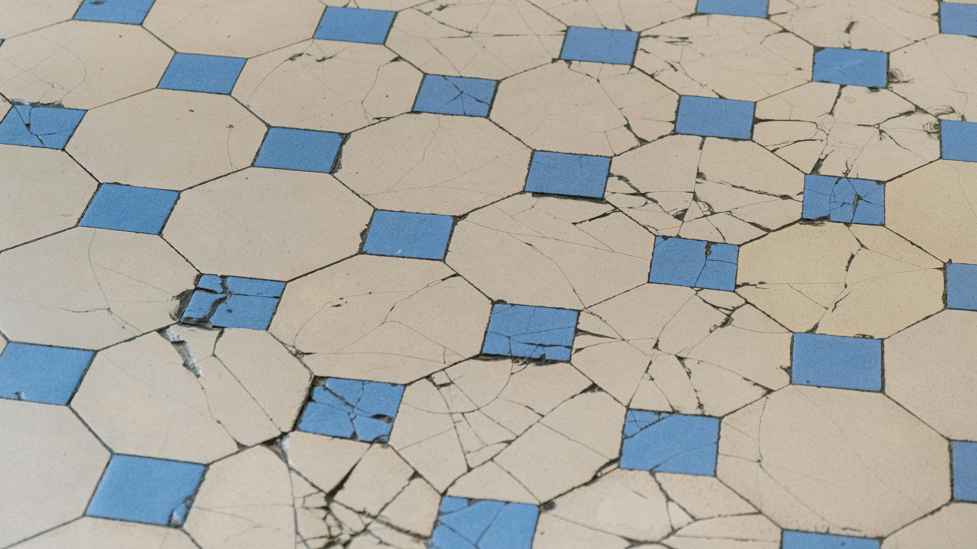
6. Bumpy Flooring That Slows You Down
Those little ridges and texture changes in the flooring aren’t always due to sloppy construction. Oftentimes, they're actually intentional "speed bumps" that are designed to make you move more slowly. The longer you’re inside, the more chances you have to toss extras into the cart.
7. Windowless Design
Some supermarkets minimize windows so you’re less aware of what’s happening outside. When time feels vague, it’s easier to keep browsing and wandering. And wandering is basically the store’s favorite hobby for you.
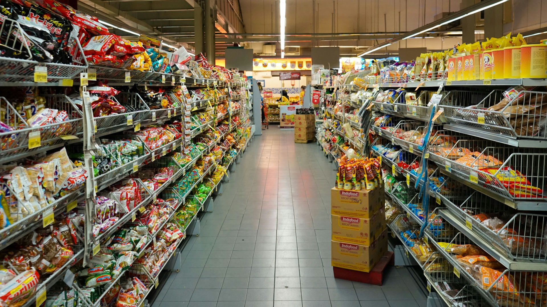
8. Staples Placed Far Apart to Maximize Temptation
The items you came for are often spaced out on purpose, so you have to pass a lot of other products to get them. Meat in one corner, bread in another, and dairy in the back creates a forced tour. That extra distance is basically a sales opportunity disguised as a floor plan.
9. Dairy in the Back
Milk, butter, and similar basics are called destination items because you’ll keep coming back for them. Putting them at the back of the store guarantees you’ll walk past a bunch of other merchandise first. Even if you stay focused, your eyes still get exposed to plenty of impulse bait.
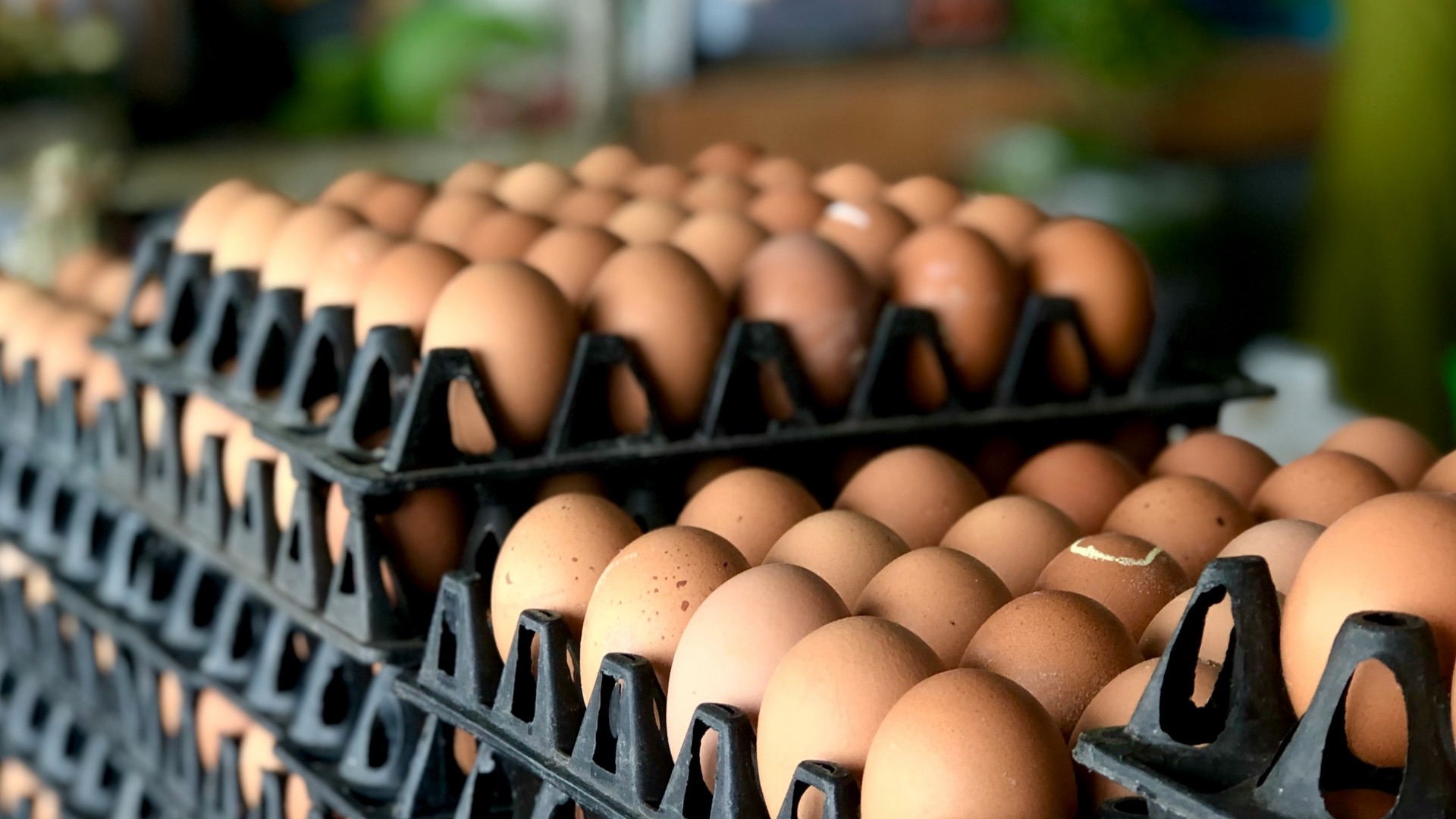
10. Layout Refreshes That Turn into a Scavenger Hunt
Stores sometimes move familiar items elsewhere so you have to search and linger longer. That extra hunt adds minutes, and minutes add impulse buys. If eggs feel like they’re always migrating to somewhere else, that’s on purpose.
11. High-Margin Items Placed Front and Center
Right when you walk in, you’re more open to temptation because you haven’t made a dozen decisions yet. That’s why profitable items like flowers, baked goods, and ready-to-eat foods often get prime real estate. It sets the tone: you're meant to spend here, and spend more.
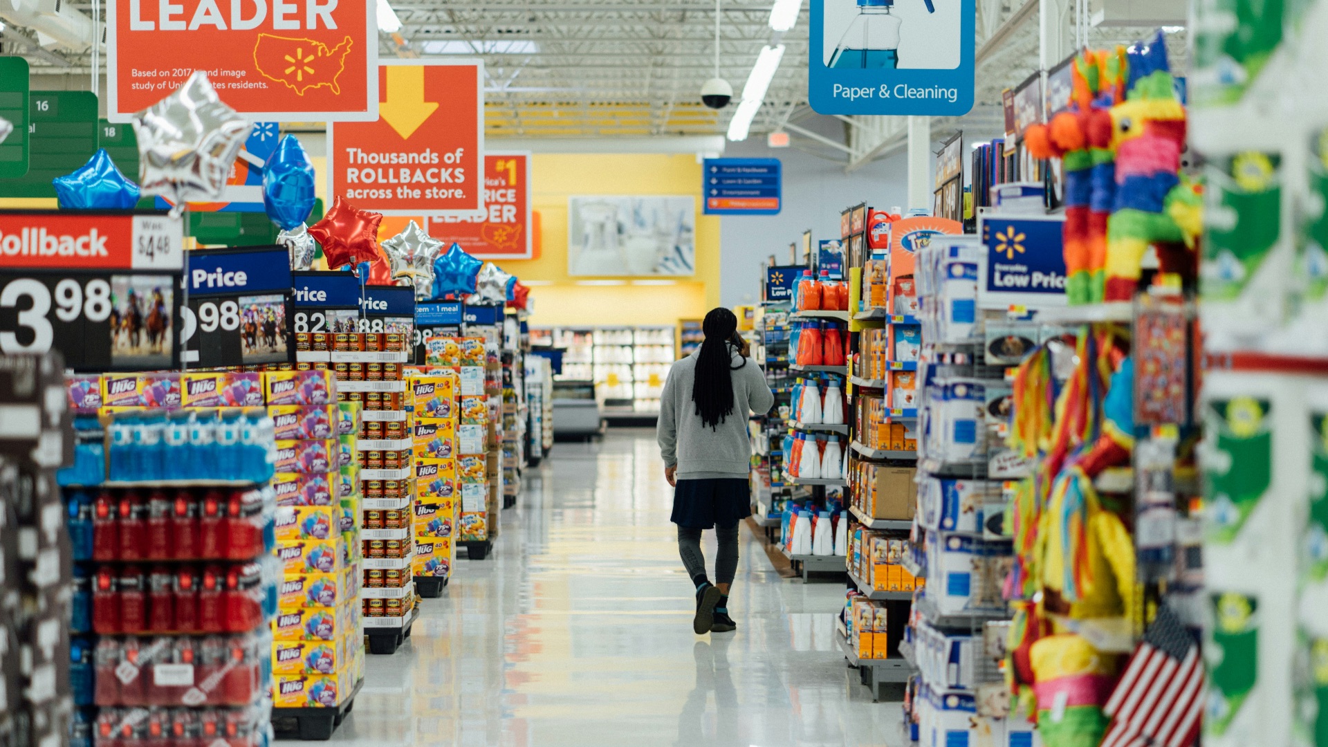
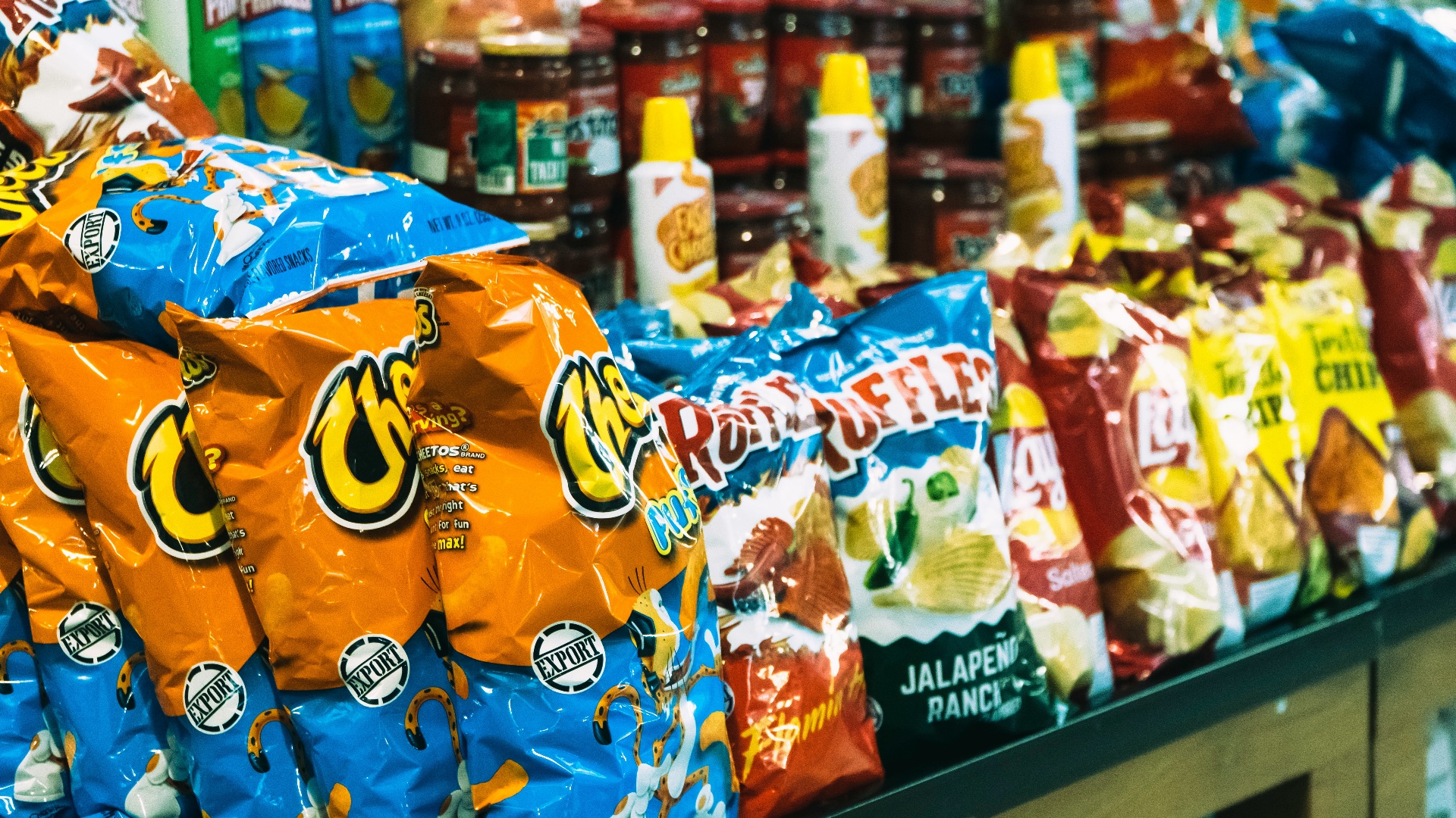
12. Endcaps That Act Like Billboard Space
The ends of aisles get more attention than the middle because you can’t really avoid seeing them. Brands often pay for those spots because they work, especially for snacks and other miscellaneous items. Even when you don’t need those items, visibility makes them feel familiar and tempting.
13. “Racetrack” Aisles That Keep You Circling
Long, straight aisles can subtly encourage you to walk the full length instead of darting in and out. That repetition builds more exposure to more products, over and over. Extra exposure doesn’t guarantee you’ll buy, but it sure improves the odds.
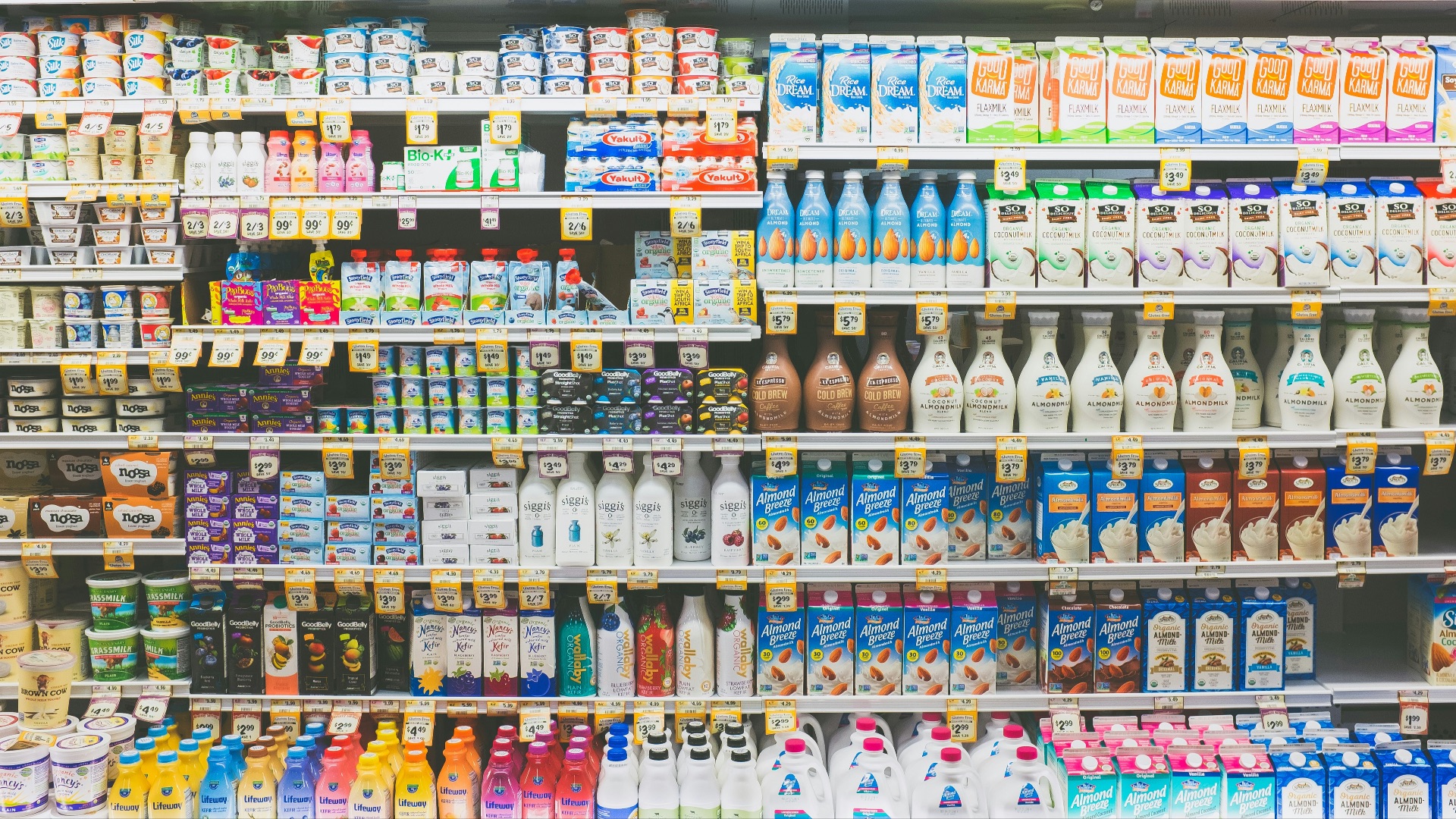
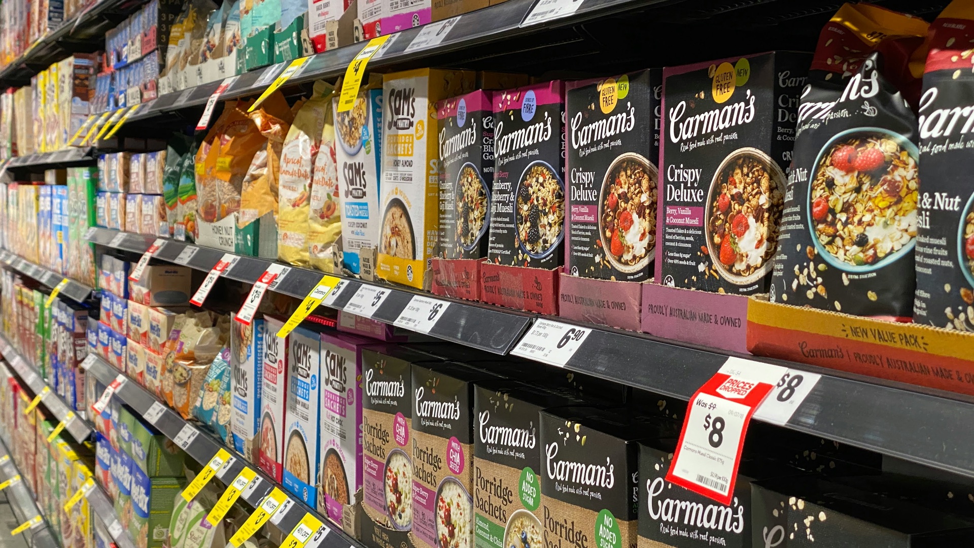
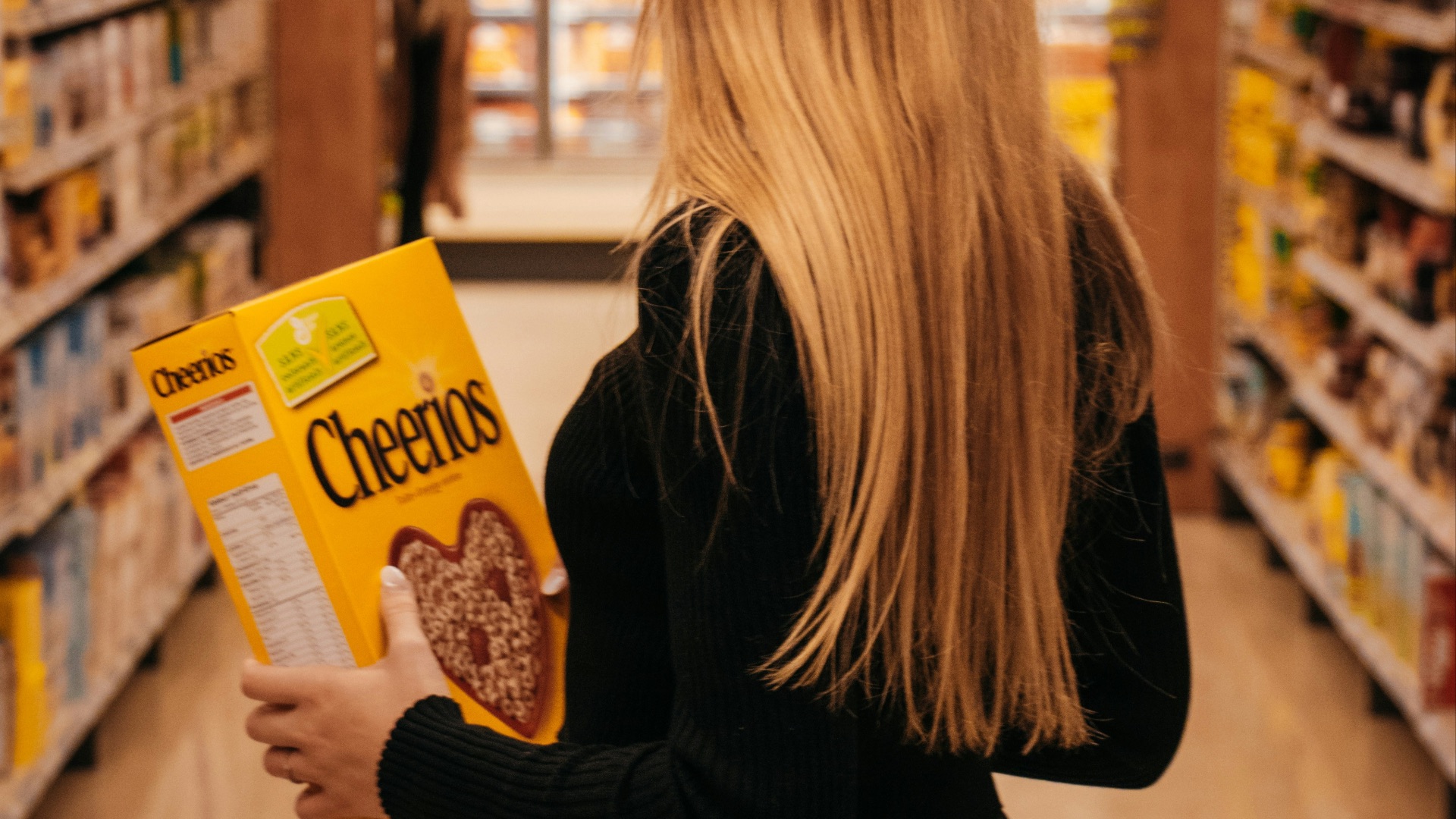
14. Shelf Placement That Puts the Priciest Stuff at Eye Level
You’re more likely to grab what you see first, so expensive options often sit right where your gaze naturally lands. Cheaper choices may be placed higher or lower, which adds just enough friction to change decisions. Kid-targeted products are often also placed lower so children spot them easily.
15. Slow Music That Makes You Linger
A relaxed soundtrack can slow your pace without you noticing. If you’re moving slower, you’re browsing more, and browsing leads to extra things in your cart. Some stores even break the music to run quick announcements so your brain perks up and listens.
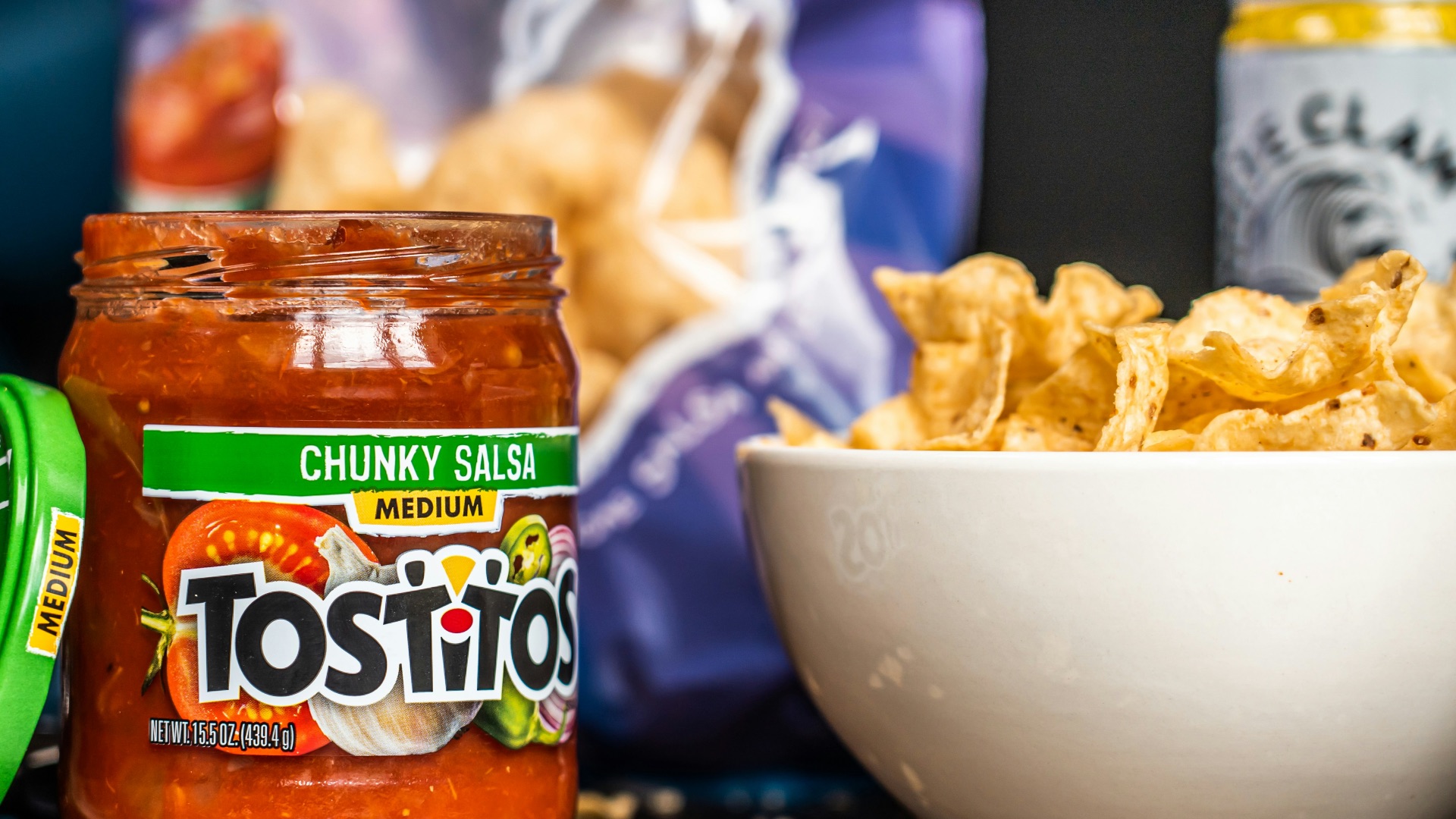
16. Cross-Merchandising
Chips next to salsa sounds convenient, but it's usually on purpose, as it encourages you to buy the items as a pair. Suddenly you’re not buying one thing, you’re buying a whole snack situation. It’s an easy way to turn a single craving into a mini bundle.
 Hybrid Storytellers on Unsplash
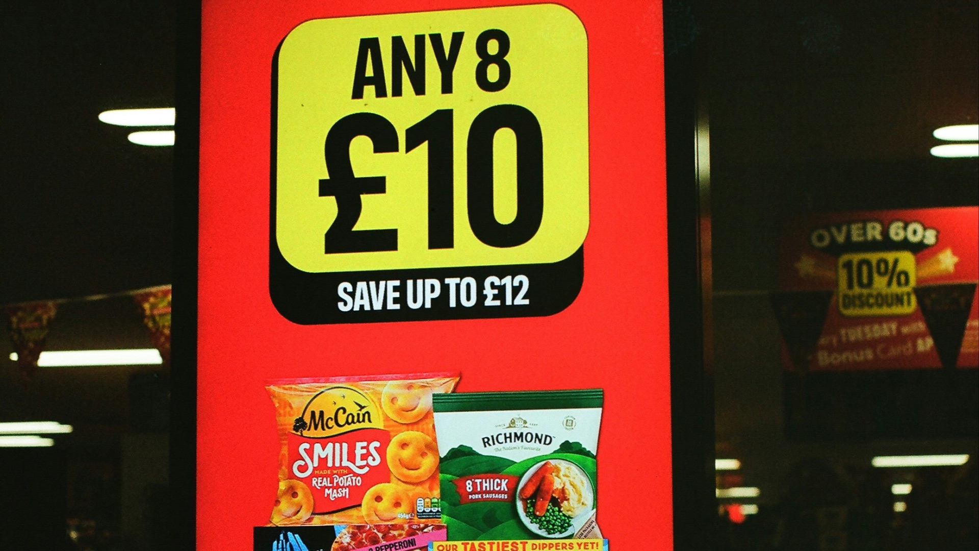
17. Circulars and Promos
Big sale messaging can make you assume you’re saving, so you stop checking the actual price. Some advertised items aren’t discounted much, or at all, but the suggestion of a deal is powerful, and that can easily change your mind. If you don’t compare, the store gets the win.
18. Multi-Buy Deals That Distract You From Unit Price
Sure, “10 for $10” feels satisfying, like you cracked a secret deal. But think again: the per-unit math can sometimes be worse than buying fewer, and the format nudges you to purchase more than you planned. It’s a classic way to turn quantity into a reflex.
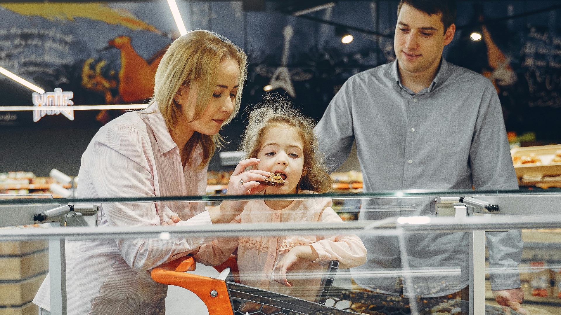
19. Samples Galore
A bite of something tasty is a fast shortcut to convincing you to buy the whole product. Samples also slow your trip and shift you into browsing mode, which is prime impulse territory. If you’re shopping with kids, the pressure to say yes can get even stronger.
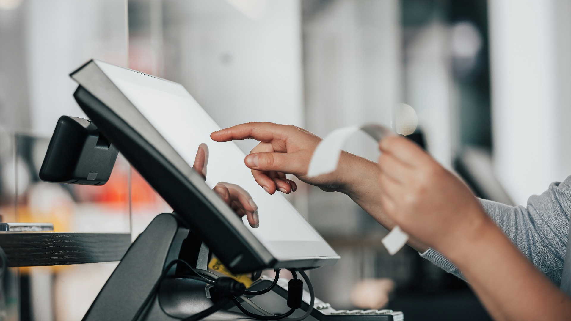
20. Loyalty Programs That Nudge Bigger Spending
Rewards programs can feel like you’re gaming the system, but they also help stores track what you buy so they can target you better. People can even spend more after joining because it feels like spending will “pay off” in savings. On top of that, retailers use pricing tricks like price anchoring to steer you toward the middle (more expensive) option.
KEEP ON READING